Getting started with Strelit Layout is a breeze, but a bit of handholding is always nice. This tutorial takes you through the initial steps until you're up and running with your first managed layout.
Including Dependencies
Strelit UI Kit v0.2.0 is engineered with modern TypeScript and ES modules. For standalone HTML integrations or rapid prototypes, include the primary bundle along with your preferred theme stylesheet:
<script type="text/javascript" src="https://strelit.dev/assets/dist/iife/index.global.js"></script>
<link
  type="text/css"
  rel="stylesheet"
  href="https://strelit.dev/assets/dist/css/strelit-base.css"
/>
strelit-base.css contains purely the structural layout bits, so you also need a
visual theme. Choose one of our curated themes and include its CSS file:
<link
  type="text/css"
  rel="stylesheet"
  href="https://strelit.dev/assets/dist/css/themes/strelit-dark-theme.css"
/>
For modern bundlers (Vite, Webpack, or Rollup), simply import the module and theme in your application entry point:
import { StrelitLayout } from 'strelit-ui-kit';
import 'strelit-ui-kit/dist/css/strelit-base.css';
import 'strelit-ui-kit/dist/css/strelit-dark-theme.css';
Configuring the Layout
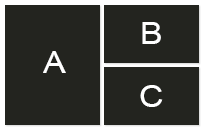
Next we need to configure the initial layout (the user can move things around later). For this example we'll create a big component on the left of the screen and two smaller ones on the right, on top of each other, like so:
All Strelit Layout structures are created from three building blocks: Rows, Columns and Stacks. Row's arrange items from left to right, Columns from top to bottom and Stacks from front to back (as a tab-strip). These can be nested.
The actual parts that your app is composed of (forms, charts, tables etc.) are referred to as "components". Components can be put into any of these building blocks.
For our example we'll start with a row. The first item in this row is the big component that we want to put on the left hand side (A). To the right we want two components on top of each other (B and C) - so we need to put them into a column.
The whole structure should look like this:
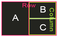
Or as Strelit Layout configuration:
const config = {
  root: {
    type: 'row',
    content: [
      {
        type: 'component',
        componentType: 'testComponent',
        componentState: { label: 'A' },
      },
      {
        type: 'column',
        content: [
          {
            type: 'component',
            componentType: 'testComponent',
            componentState: { label: 'B' },
          },
          {
            type: 'component',
            componentType: 'testComponent',
            componentState: { label: 'C' },
          },
        ],
      },
    ],
  },
};
Key concepts in this configuration:
The top-level layout tree begins at
root(which can be a‘row’,‘column’,‘stack’, or‘component’).Every container item (rows, columns, stacks) holds children in its
contentarray.componentTypespecifies which registered component factory will render inside this pane.componentStatecan be any serialisable object, string, or number passed to the component container.
Instantiating the Layout
Strelit UI Kit separates DOM binding from layout loading. First, instantiate
StrelitLayout on your target DOM container:
const containerEl = document.getElementById('layoutContainer');
const myLayout = new StrelitLayout(containerEl);
Passing a DOM element or selector string binds Strelit to that container element. If omitted,
Strelit attaches to document.body.
Registering Components
In our configuration we referenced 'testComponent'. Register its factory
function using registerComponentFactoryFunction:
myLayout.registerComponentFactoryFunction('testComponent', (container, itemConfig) => {
  const state = itemConfig.componentState || {};
  container.element.innerHTML = '<h2>' + state.label + '</h2>';
});
The factory function receives two parameters:
container(ComponentContainer): provides direct access to native DOM element
container.element, dimensions (width,height), tab handles, and lifecycle events (resize,destroy,focus,blur).itemConfig: The configuration item containingcomponentState,title, and item options.
Loading the Layout
Finally, load the configuration into the layout engine to render all panes and start the docking workspace:
myLayout.loadLayout(config);Result
Here is the fully interactive layout running live in your browser. Feel free to drag tabs, tear them off, or resize splitters: